
REDESIGN
AND NEW FILTERS
MerchantView™ helps banks and payment service providers identify hidden risks in their merchant portfolios. By analyzing entire digital ecosystems, MerchantView™ helps users identify illicit activity, prevent online transaction laundering, and maintain regulatory compliance.

THE MAIN CHALLENGE
The main challenge was to combine many scattered filters in one location in order to increase accessibility and functionality. This involved a modern redesign of the user interface that facilitates simple filter use, faster searches, and the added ability to compile and save your own filters.

MY ROLE AND TEAM
As a UX / UI designer, I worked on all phases
of the project, from the idea, user research, surveys, wireframes, and prototypes to the final UI design and delivery to the development team. I worked closely with product managers and developers, as well as the customer success, technical writer and BI teams.

THE SOLUTION
-
Place all filters in one place
-
Add advance filter
-
Change UX / UI to be more modern and clean
-
Change microcopy
STARTED WITH...
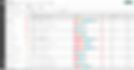
PROBLEM 1
MULTIPLE FILTERS
The user has many filters in different places that are difficult to find. There is also a "GO" button, which the user does not always see and use. Sometimes the user thinks that he has chosen filters and works all day without them, reducing capacity.
PROBLEM 2
Every morning, the risk analyst has to re-select the necessary filters. This takes extra time and is irritating to the user. It also creates additional room for errors and inefficiency due to not selecting or selecting the wrong filters each and every time.
NO ADVANCE FILTERS
PROBLEM 2
Nowadays, we all use desktop and smartphone applications. If we see an old-fashioned program, it affects our attitude towards the program and the company that developed it. Our users are tech-savy and familiar with modern designs and applications, and we wanted to improve this element of the user experience for our customers. Also, after careful checking, we found that the microcopy was not always consistent and clear.
OUTDATED UI DESIGN

RESEARCHING
UX
I began by discussing the primary issues with the product manager. I followed this with user interviews, as well as conversations with my peers regarding customer success and support. All of these led me to a more extensive understanding of user needs.
Before getting started, I researched filters in other products such as Notion, Monday, and JIRA. I also read several articles from various resources including: https://pencilandpaper.io, https://uxdworld.com, and others.
USER PERSONA
JESSICA
25 / RISK ANALIST / LONDON UK
Jessica is a young and tech-savy risk analyst at a London bank. She is a new employee and is very proud of working for a big company. Jessica rents a small apartment in central London. Every evening she goes home after work, goes to a small cafe next to the house, and drinks a cup of coffee with a croissant. Jessica has a red cat. She calls it Risky, the name comes from the word "risk", because every day she checks the risks of her clients and she really likes her work.
THE USERS AND THEIR NEEDS
Every morning, the risk analyst has to re-select the necessary filters. This takes extra time and is irritating to the user. It also creates additional room for errors and inefficiency due to not selecting or selecting the wrong filters each and every time.


SURVEY
USER RESEARCH
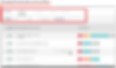
The team and I decided to run a survey to determine which filters are created and used with what frequency, as well as how users felt about their experiences. We wanted to know which filters were used most often in order to facilitate easier access, and which filters are less important and could safely be hidden under an "All Filters" button. The survey responses clearly showed that creating filters is not easy for most users.
The BI team (business intelligence) was also consulted on the use of filters, and the BI team data was in agreement with the user responses. Using both the survey data and the BI team insight, we decided to leave three filters on top “RISK”, “TYPE” and “Category”. We also decided to remove the "GO" button because it rarely used.
SKETCHING
Before I started working on wireframes, based on the research we had done, I drew hand sketches that helped me and the product manager understand how we should design our new filters.
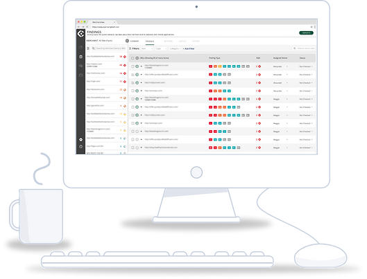
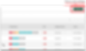
ALL FILTERS IN ONE PLACE
All the filteris in one place that allow a quick filtering

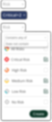
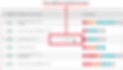
ADVANCE FILTERS
An advance filters that allow to an user to save his own filters and working esear ans faster.

WIREFRAMES
I created wireframes to get an idea of the new filters and redesign. I changed the design of the tabs, the location of the "Settings" and "Help" buttons, moved all the filters to one place, and also hid some functions that would now only be visible when the user hovers over selected areas.

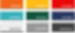
COLOR PALLETE
PIXEL PERFECT
One of the challenges is matching colors that are supposed to work together in harmony. The goal is to eliminate any flicker that the eye may perceive with the color combinations, so that they can be visually interpreted without issue and be integrated into the user mindset as part of the identifying brand elements.
BUTTON SYSTEM
I updated the buttons to have a rounded design, which gave them a more modern appearance than the rectangular buttons previously in use. This new design feature also complemented the new, darker color pallet. And I created various new sizes for the primary and secondary button options.

TYPOGRAPHY
I used the pre-established brand fonts for titles and paragraphs Space Grotesk and Open Sans. I chose to improve the user experience by increasing the font readability through contrast and size manipulations.

ICONS
I used icons that are widely recognizable, easily understood, and well-suited to the product. This helps simplify visual elements and reinforce the brand image.
THE DESIGN SYSTEM
I created a design system for the new filters which facilitates brand consistency and helps developers and designers to work quickly and more efficiently.
Filter Sizes
The maximum dropdown height is 394 pixels

The filter badges will include a dynamic width with a Max limitation accordingly. If the selected filter is bigger than the max size > add a ... at the end.

Example for Evidence Filter flow


Example for Risk filter flow


Example for Risk filter flow
THE FINAL DESIGN
UI
New clean design language with user interface components.

BEFORE
AFTER
DESIGN CHANGES


RESULTS
The users received newly-designed UI and UX experiences with modern visual elements and simplified functionality. The choices available are now streamlined, clearly visible, and easily accessible. These altered elements have resulted in greater user success and satisfaction.
